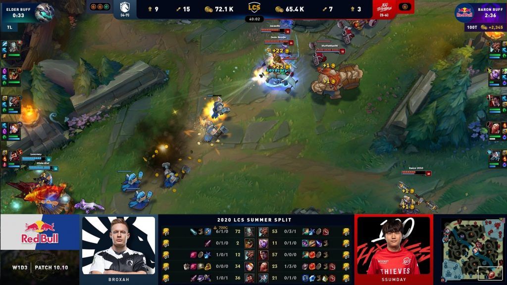
With the LCS 2020 Summer Split starting today, the LCS is launching a new heads-up display (HUD) that will bring viewers an experience that mirrors a traditional sports format.
In 2019, the league went for a more mystical design for the HUD, perfectly meshing with the game’s setting of Runeterra. These stylized modifications echoed what games looked like for the viewers, with competing teams displayed as either the blue or red side. However, the Hextech-style HUD did not provide much substance in an esports format.
“While the high fantasy design meets the gameplay needs, it doesn’t necessarily meet the needs of the LCS,” said the LCS in an official blog post. “We wanted to explore how we could better connect the HUD to the LCS as a brand, visual style, and sport.”
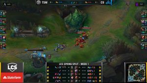
You can definitely see these changes in the recent Spring Split. There’s less homage to the game’s setting and more dedication to the game’s sports action. You have team logos, better contrasting color schemes, and Drake and Baron timers just at a glance.
- LCS meme queen Ovilee May steps down from LCS broadcast team
- Golden Guardians add Damonte and Olleh for LCS 2020 Summer Split

As a whole, the LCS strike team will be focusing on two major areas in the HUD update:
- Improving overall readability and digestion of information for all stages of a game — and, simply make the HUD look nicer
- Implementing a streamlined visual style that the LCS could own as a modern sport
From the HUD preview, you can see that the visuals provide the most stats in the best way possible. The top bar has a more spread-out design, featuring tons of statistics in white font color, while the bottom display features team branding and colors to make matches more unique amongst one another.
You can catch the new and improved HUD on the official LCS Twitch channel.
READ MORE: LCS 2020 Summer Split pre-season power rankings: Cloud9 flies to first


